Product Design
Perpelio: Designing for Institutional Trust
Role :
Product Designer
Client :
Biconomy
Perpelio offers two yield products built on a shared financial flywheel. I led the full 0→1 design, logo, brand system, and web app, making complex vault mechanics feel transparent, trustworthy, and worth the lock-up.

Vaults & Secure Asset Storage
The Context
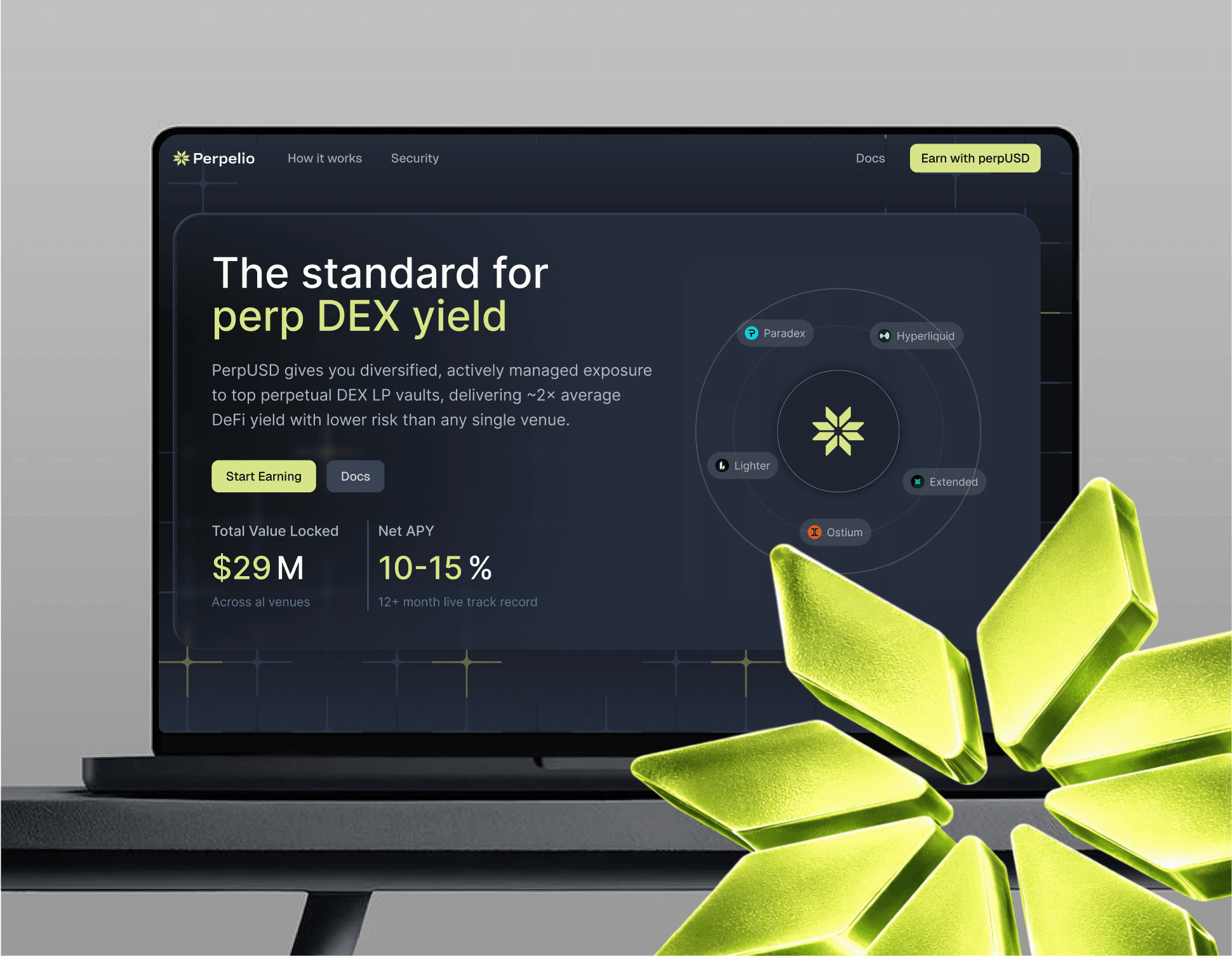
Perpelio offers two core products: Stake LIT and Earn USDC, a long-term play requiring users to lock up significant capital with confidence.
The Challenge
Led 0 to 1 across logo, brand, and web app. Core UX challenge was psychological, shifting users from 'crypto gambling' mindset to institutional calm.
A Psychology-Driven Visual Identity
The Strategy
To attract serious capital, every visual decision had to communicate stability before a single word was read.
Color Psychology
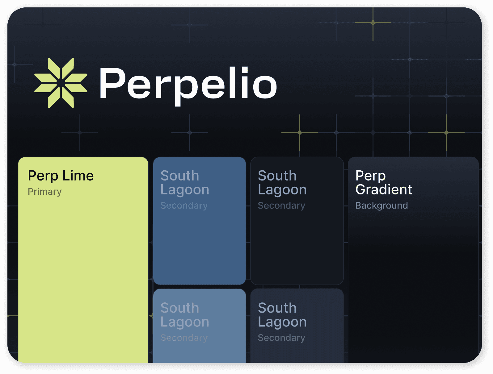
Stepped away from aggressive crypto trends. Anchored in unsaturated blue, security, calm, institutional safety. Reduces anxiety when handling large sums.
Intentional Contrast
Sharp Lime as the primary CTA cuts through the calm without breaking it, creating undeniable hierarchy to critical actions.
Visualizing Complex Yield Mechanics
The UX Challenge
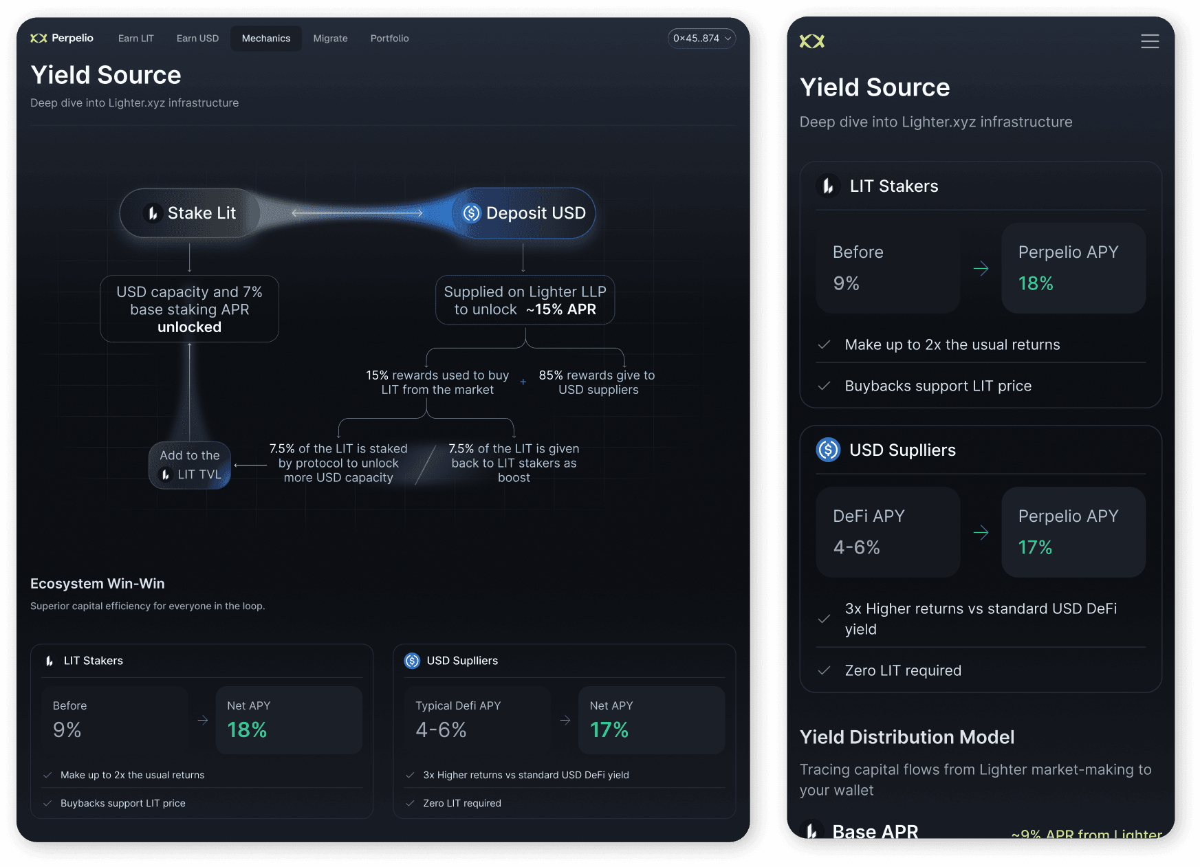
The vaults run on an interdependent flywheel, Stake LIT unlocks capacity for Deposit USD. Explaining this without overwhelming users was critical for trust.
Transparent Architecture
Instead of a black box, we mapped capital flows and reward splits directly in the UI, demystifying the smart contracts.
Communicating the Value
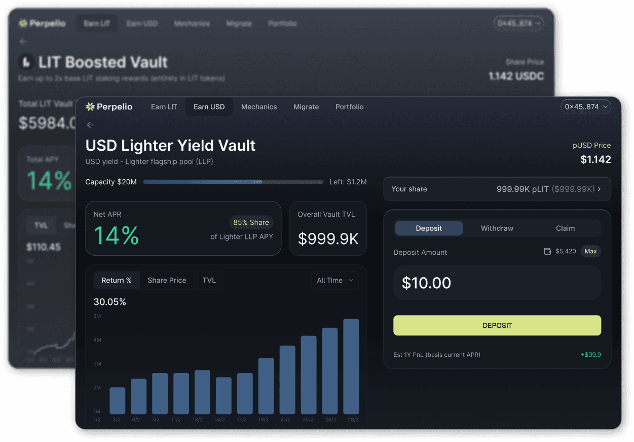
Comparison cards juxtapose typical DeFi APYs (4-6%) against our 17%, transparent data that justifies the lock-up period instantly.
Final UI & Strategic Evolution
The Result
Shipped an institutional-grade web app combining calm color psychology with transparent data visualization.
The Strategic Evolution
The modular foundation, same typography, component logic, spacing, scales directly into the Perp DEX Index without a redesign.
Key Outcomes
0 to 1 brand and app that shifts perception from high-risk trading to secure long-term yield. Architecture built to expand, not rebuild.
Scaling to the Perp DEX Index
The Evolution
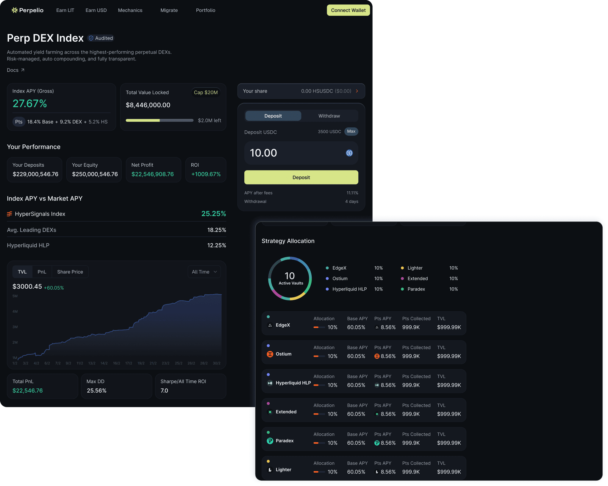
Perpelio's final form: a full Perpetual DEX Index. The challenge was reintroducing trading complexity without breaking the institutional calm we'd just built.
System Scalability
Built on Tailwind and Shadcn, the transition to a dense trading interface was seamless, same typography, component logic, and spacing rules throughout.
Maintaining Trust in High-Complexity
Even at maximum data density, the unsaturated blue holds the calm. Lime CTAs cut through clearly, guiding users to action without friction.
More Projects


Product Design
Perpelio: Designing for Institutional Trust
Role :
Product Designer
Client :
Biconomy
Perpelio offers two yield products built on a shared financial flywheel. I led the full 0→1 design, logo, brand system, and web app, making complex vault mechanics feel transparent, trustworthy, and worth the lock-up.
Vaults & Secure Asset Storage
The Context
Perpelio offers two core products: Stake LIT and Earn USDC, a long-term play requiring users to lock up significant capital with confidence.
The Challenge
Led 0 to 1 across logo, brand, and web app. Core UX challenge was psychological, shifting users from 'crypto gambling' mindset to institutional calm.
A Psychology-Driven Visual Identity
The Strategy
To attract serious capital, every visual decision had to communicate stability before a single word was read.
Color Psychology
Stepped away from aggressive crypto trends. Anchored in unsaturated blue, security, calm, institutional safety. Reduces anxiety when handling large sums.
Intentional Contrast
Sharp Lime as the primary CTA cuts through the calm without breaking it, creating undeniable hierarchy to critical actions.
Visualizing Complex Yield Mechanics
The UX Challenge
The vaults run on an interdependent flywheel, Stake LIT unlocks capacity for Deposit USD. Explaining this without overwhelming users was critical for trust.
Transparent Architecture
Instead of a black box, we mapped capital flows and reward splits directly in the UI, demystifying the smart contracts.
Communicating the Value
Comparison cards juxtapose typical DeFi APYs (4-6%) against our 17%, transparent data that justifies the lock-up period instantly.
Final UI & Strategic Evolution
The Result
Shipped an institutional-grade web app combining calm color psychology with transparent data visualization.
The Strategic Evolution
The modular foundation, same typography, component logic, spacing, scales directly into the Perp DEX Index without a redesign.
Key Outcomes
0 to 1 brand and app that shifts perception from high-risk trading to secure long-term yield. Architecture built to expand, not rebuild.
Scaling to the Perp DEX Index
The Evolution
Perpelio's final form: a full Perpetual DEX Index. The challenge was reintroducing trading complexity without breaking the institutional calm we'd just built.
System Scalability
Built on Tailwind and Shadcn, the transition to a dense trading interface was seamless, same typography, component logic, and spacing rules throughout.
Maintaining Trust in High-Complexity
Even at maximum data density, the unsaturated blue holds the calm. Lime CTAs cut through clearly, guiding users to action without friction.
More Projects
Product Design
Perpelio: Designing for Institutional Trust
Role :
Product Designer
Client :
Biconomy
Perpelio offers two yield products built on a shared financial flywheel. I led the full 0→1 design, logo, brand system, and web app, making complex vault mechanics feel transparent, trustworthy, and worth the lock-up.
Vaults & Secure Asset Storage
The Context
Perpelio offers two core products: Stake LIT and Earn USDC, a long-term play requiring users to lock up significant capital with confidence.
The Challenge
Led 0 to 1 across logo, brand, and web app. Core UX challenge was psychological, shifting users from 'crypto gambling' mindset to institutional calm.
A Psychology-Driven Visual Identity
The Strategy
To attract serious capital, every visual decision had to communicate stability before a single word was read.
Color Psychology
Stepped away from aggressive crypto trends. Anchored in unsaturated blue, security, calm, institutional safety. Reduces anxiety when handling large sums.
Intentional Contrast
Sharp Lime as the primary CTA cuts through the calm without breaking it, creating undeniable hierarchy to critical actions.
Visualizing Complex Yield Mechanics
The UX Challenge
The vaults run on an interdependent flywheel, Stake LIT unlocks capacity for Deposit USD. Explaining this without overwhelming users was critical for trust.
Transparent Architecture
Instead of a black box, we mapped capital flows and reward splits directly in the UI, demystifying the smart contracts.
Communicating the Value
Comparison cards juxtapose typical DeFi APYs (4-6%) against our 17%, transparent data that justifies the lock-up period instantly.
Final UI & Strategic Evolution
The Result
Shipped an institutional-grade web app combining calm color psychology with transparent data visualization.
The Strategic Evolution
The modular foundation, same typography, component logic, spacing, scales directly into the Perp DEX Index without a redesign.
Key Outcomes
0 to 1 brand and app that shifts perception from high-risk trading to secure long-term yield. Architecture built to expand, not rebuild.
Scaling to the Perp DEX Index
The Evolution
Perpelio's final form: a full Perpetual DEX Index. The challenge was reintroducing trading complexity without breaking the institutional calm we'd just built.
System Scalability
Built on Tailwind and Shadcn, the transition to a dense trading interface was seamless, same typography, component logic, and spacing rules throughout.
Maintaining Trust in High-Complexity
Even at maximum data density, the unsaturated blue holds the calm. Lime CTAs cut through clearly, guiding users to action without friction.