Product Design
Lucid
Role :
Product Designer
Client :
The problem
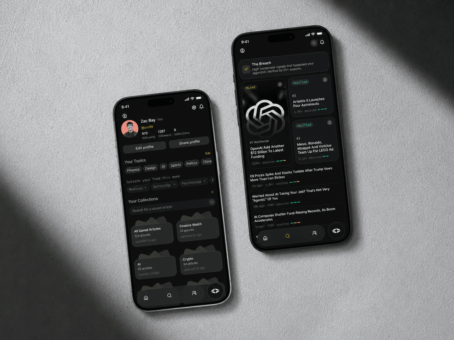
Gen Z reads more news than any generation before them, and trusts less of it. The apps built to serve them optimise for engagement, not understanding. They're drowning in content with no way to filter signal from noise.
The Goal Build: a product that doesn't just deliver news, but tells you what's confirmed, what's contested, and what's being left out entirely.
The Design Challenge: Make transparency feel native, not clinical. Trust signals need to be readable in seconds, not require a manual.
Research & The Core Insight
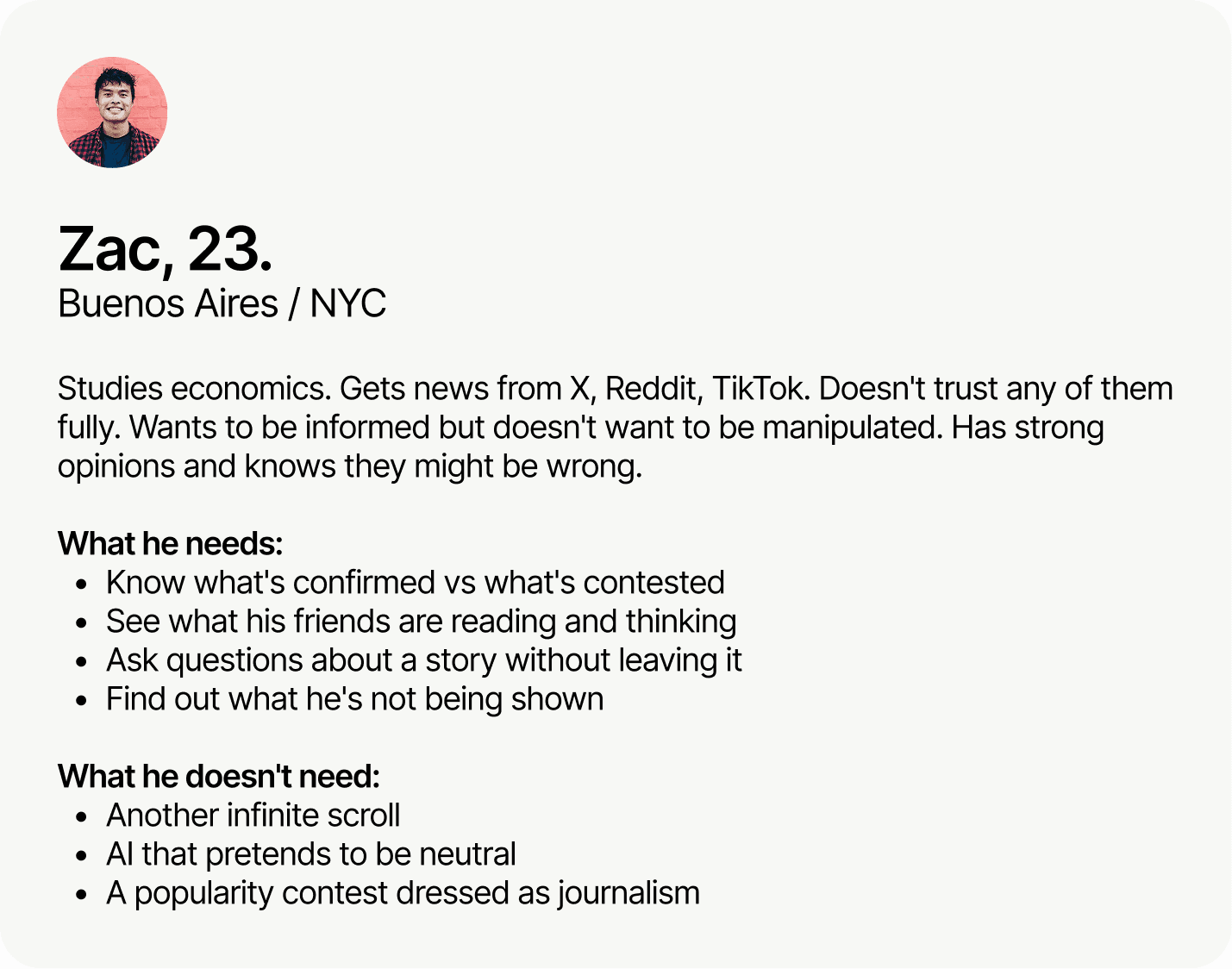
The UX Insight The problem isn't too little news. It's too little signal. Gen Z doesn't need more content, they need to know what to trust, who agrees, and what they're not being shown.
The Strategy Radical transparency as a design principle. Every AI decision visible. Every source traceable. The algorithm explained, not buried.
Designing the Feed
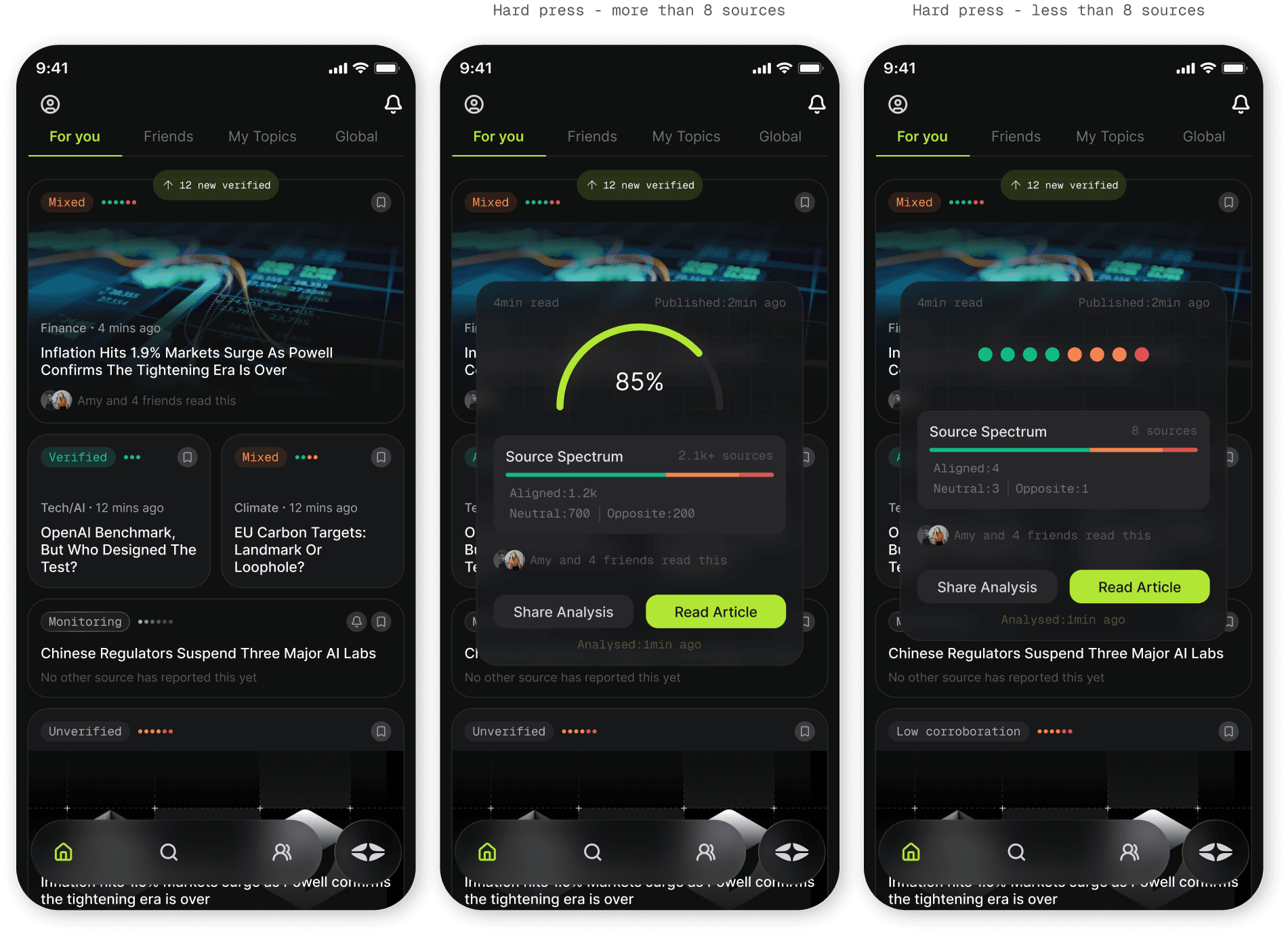
The Core Challenge: Communicate trust before the user taps anything.
The Three-Layer Signal: Every card shows a verification badge, a row of coloured dots representing source alignment, and a social layer showing friends who've engaged. Three layers of signal, readable in under two seconds.
The Hard Press: Revealing the source spectrum on hard press, not on tap, was a deliberate progressive disclosure decision. Depth is always available. It never interrupts.
Visual Language
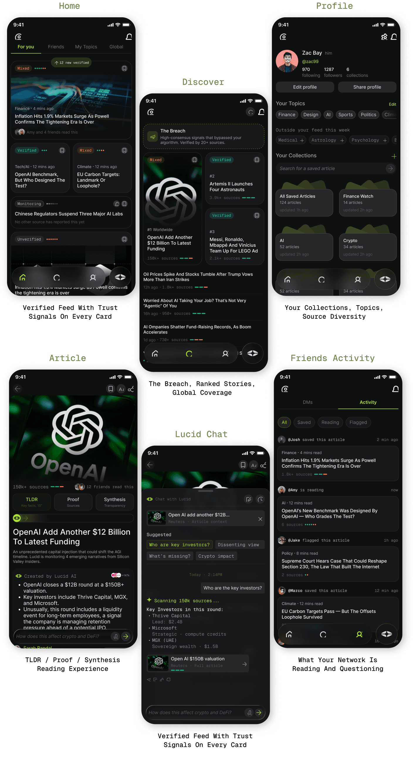
Typography as Signal Inter for all human editorial voice, headlines, UI, brand. Geist Mono exclusively for AI-generated outputs, summaries, source counts, analysis labels. You always know what's human and what's machine.
Verification Colour System Four states: Verified (green), Mixed (orange), Monitoring (grey), Unverified (red). Reserved exclusively for trust signals, no decorative use anywhere.
Dark-first High-information density reads better on dark backgrounds. Keeps focus on content, not chrome.
More Projects


Product Design
Lucid
Role :
Product Designer
Client :
The problem
Gen Z reads more news than any generation before them, and trusts less of it. The apps built to serve them optimise for engagement, not understanding. They're drowning in content with no way to filter signal from noise.
The Goal Build: a product that doesn't just deliver news, but tells you what's confirmed, what's contested, and what's being left out entirely.
The Design Challenge: Make transparency feel native, not clinical. Trust signals need to be readable in seconds, not require a manual.
Research & The Core Insight
The UX Insight The problem isn't too little news. It's too little signal. Gen Z doesn't need more content, they need to know what to trust, who agrees, and what they're not being shown.
The Strategy Radical transparency as a design principle. Every AI decision visible. Every source traceable. The algorithm explained, not buried.
Designing the Feed
The Core Challenge: Communicate trust before the user taps anything.
The Three-Layer Signal: Every card shows a verification badge, a row of coloured dots representing source alignment, and a social layer showing friends who've engaged. Three layers of signal, readable in under two seconds.
The Hard Press: Revealing the source spectrum on hard press, not on tap, was a deliberate progressive disclosure decision. Depth is always available. It never interrupts.
Visual Language
Typography as Signal Inter for all human editorial voice, headlines, UI, brand. Geist Mono exclusively for AI-generated outputs, summaries, source counts, analysis labels. You always know what's human and what's machine.
Verification Colour System Four states: Verified (green), Mixed (orange), Monitoring (grey), Unverified (red). Reserved exclusively for trust signals, no decorative use anywhere.
Dark-first High-information density reads better on dark backgrounds. Keeps focus on content, not chrome.
More Projects
Product Design
Lucid
Role :
Product Designer
Client :
The problem
Gen Z reads more news than any generation before them, and trusts less of it. The apps built to serve them optimise for engagement, not understanding. They're drowning in content with no way to filter signal from noise.
The Goal Build: a product that doesn't just deliver news, but tells you what's confirmed, what's contested, and what's being left out entirely.
The Design Challenge: Make transparency feel native, not clinical. Trust signals need to be readable in seconds, not require a manual.
Research & The Core Insight
The UX Insight The problem isn't too little news. It's too little signal. Gen Z doesn't need more content, they need to know what to trust, who agrees, and what they're not being shown.
The Strategy Radical transparency as a design principle. Every AI decision visible. Every source traceable. The algorithm explained, not buried.
Designing the Feed
The Core Challenge: Communicate trust before the user taps anything.
The Three-Layer Signal: Every card shows a verification badge, a row of coloured dots representing source alignment, and a social layer showing friends who've engaged. Three layers of signal, readable in under two seconds.
The Hard Press: Revealing the source spectrum on hard press, not on tap, was a deliberate progressive disclosure decision. Depth is always available. It never interrupts.
Visual Language
Typography as Signal Inter for all human editorial voice, headlines, UI, brand. Geist Mono exclusively for AI-generated outputs, summaries, source counts, analysis labels. You always know what's human and what's machine.
Verification Colour System Four states: Verified (green), Mixed (orange), Monitoring (grey), Unverified (red). Reserved exclusively for trust signals, no decorative use anywhere.
Dark-first High-information density reads better on dark backgrounds. Keeps focus on content, not chrome.