Product Design
Circadian Health
Role :
Product Designer
Client :
Concept
Patient-facing healthcare mobile app
The Challenge
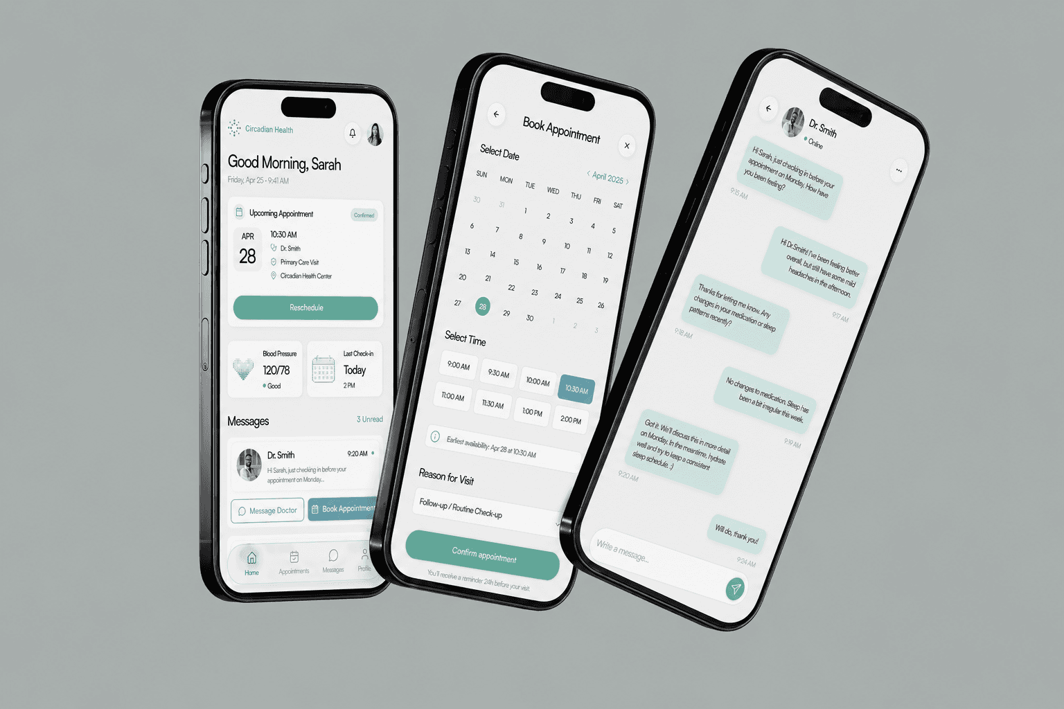
Healthcare apps often feel clinical and intimidating. We designed Meridian Health to make patient care feel warm, accessible, and human, without sacrificing clarity or professionalism.
Design Approach
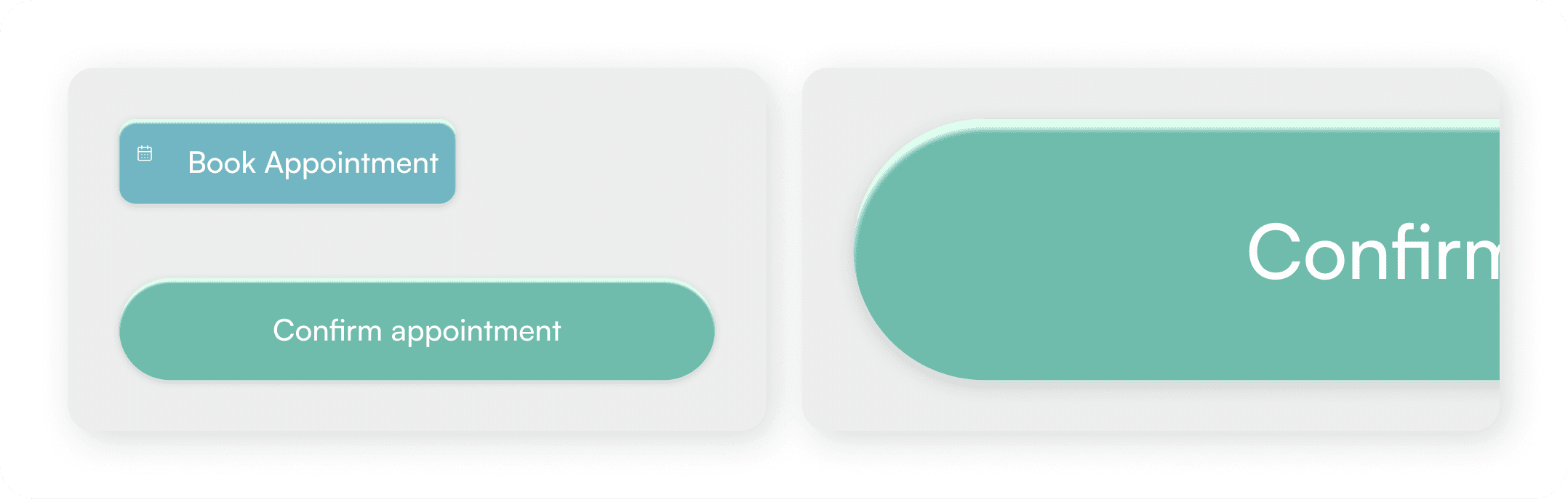
We created a warm, modern aesthetic using sage green (trust, calm) and soft blue (serenity, medical authority). The design prioritizes patient needs: quick appointment access, clear health metrics, and direct messaging with providers.
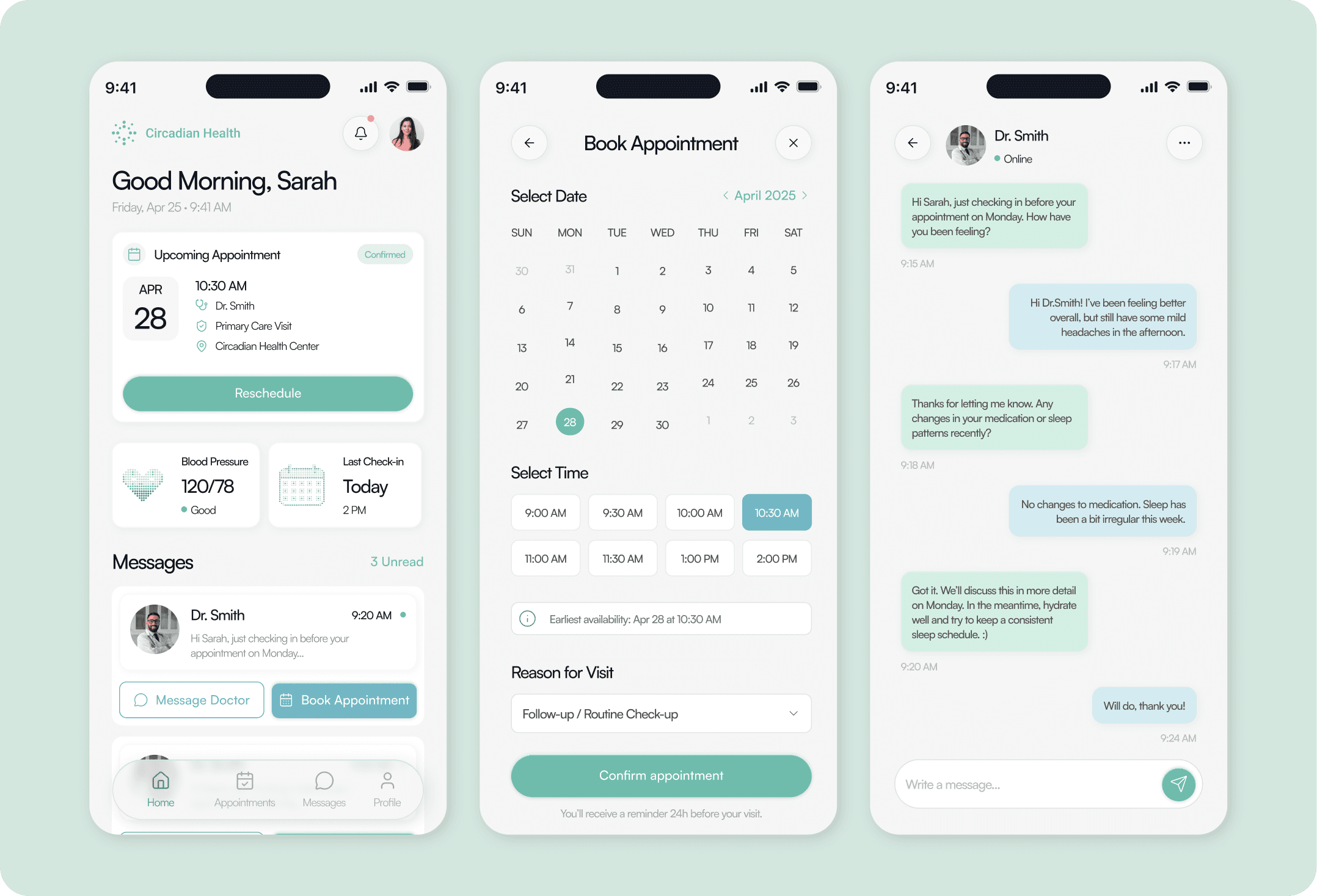
Key screens:
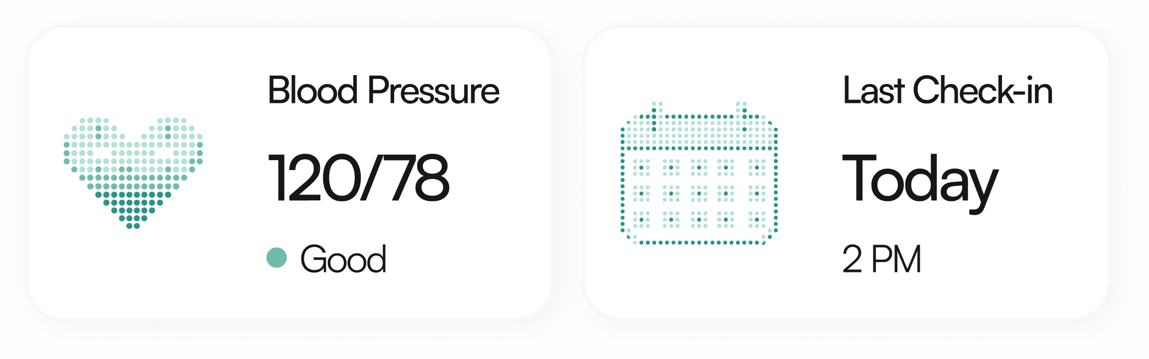
Dashboard: At-a-glance appointment info + health metrics
Booking: Simple calendar + time selection with smart defaults
Messaging: Warm, conversational thread with doctor
Design Decisions
Color system: Sage green for primary actions, soft blue for secondary, with tinted message bubbles (patient = light sage, doctor = light blue) for clear visual distinction
Typography: Large, readable body text (16px) for accessibility
Layout: Generous whitespace and soft shadows for premium, modern feel
Mobile-first: Designed for actual patient use on phones, not adapted from desktop
The result
A healthcare app that feels trustworthy and human. The design shows that thoughtful UX can make medical care feel less intimidating while maintaining professional credibility.
More Projects

Product Design
Circadian Health
Role :
Product Designer
Client :
Concept
Patient-facing healthcare mobile app
The Challenge
Healthcare apps often feel clinical and intimidating. We designed Meridian Health to make patient care feel warm, accessible, and human, without sacrificing clarity or professionalism.
Design Approach
We created a warm, modern aesthetic using sage green (trust, calm) and soft blue (serenity, medical authority). The design prioritizes patient needs: quick appointment access, clear health metrics, and direct messaging with providers.
Key screens:
Dashboard: At-a-glance appointment info + health metrics
Booking: Simple calendar + time selection with smart defaults
Messaging: Warm, conversational thread with doctor
Design Decisions
Color system: Sage green for primary actions, soft blue for secondary, with tinted message bubbles (patient = light sage, doctor = light blue) for clear visual distinction
Typography: Large, readable body text (16px) for accessibility
Layout: Generous whitespace and soft shadows for premium, modern feel
Mobile-first: Designed for actual patient use on phones, not adapted from desktop
The result
A healthcare app that feels trustworthy and human. The design shows that thoughtful UX can make medical care feel less intimidating while maintaining professional credibility.
More Projects
Product Design
Circadian Health
Role :
Product Designer
Client :
Concept
Patient-facing healthcare mobile app
The Challenge
Healthcare apps often feel clinical and intimidating. We designed Meridian Health to make patient care feel warm, accessible, and human, without sacrificing clarity or professionalism.
Design Approach
We created a warm, modern aesthetic using sage green (trust, calm) and soft blue (serenity, medical authority). The design prioritizes patient needs: quick appointment access, clear health metrics, and direct messaging with providers.
Key screens:
Dashboard: At-a-glance appointment info + health metrics
Booking: Simple calendar + time selection with smart defaults
Messaging: Warm, conversational thread with doctor
Design Decisions
Color system: Sage green for primary actions, soft blue for secondary, with tinted message bubbles (patient = light sage, doctor = light blue) for clear visual distinction
Typography: Large, readable body text (16px) for accessibility
Layout: Generous whitespace and soft shadows for premium, modern feel
Mobile-first: Designed for actual patient use on phones, not adapted from desktop
The result
A healthcare app that feels trustworthy and human. The design shows that thoughtful UX can make medical care feel less intimidating while maintaining professional credibility.