Product Design
Forkd
Role :
Product Designer
Client :
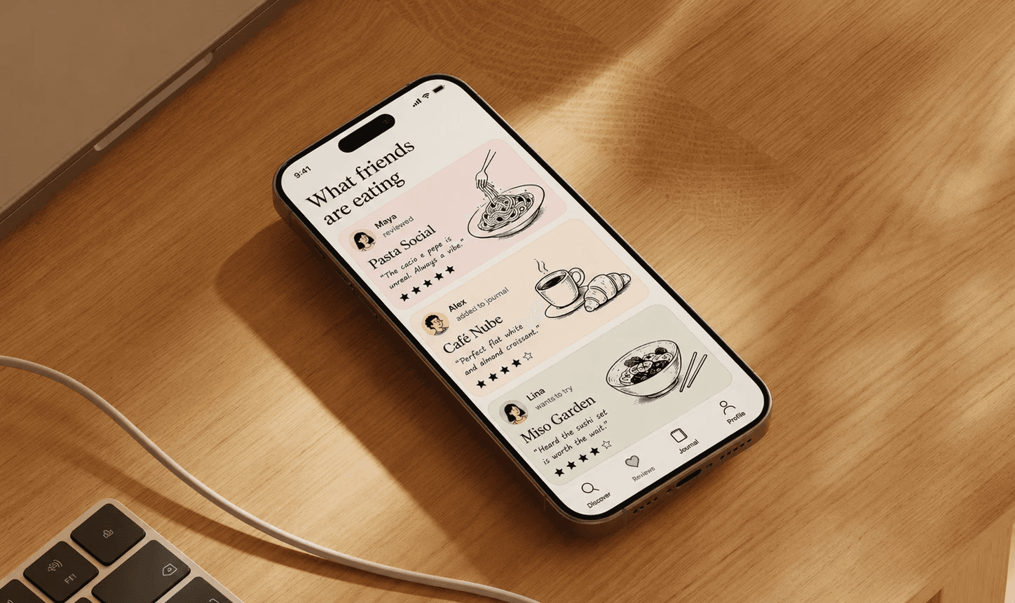
Designed a 0→1 consumer mobile app for people who treat dining as an experience worth remembering — from product concept to interactive coded prototype.
Problem
Heading: People go to incredible restaurants and forget them. Body: The notes app is a graveyard of half-remembered names. The camera roll has no context. There's no product that treats a meal the way Letterboxd treats a film.
The Goal
Build a personal dinner journal that feels as good as the meals it captures — and surfaces what friends are eating without feeling like another social feed to perform on.
The design challenge
Consumer apps live or die by emotional resonance. Coming from fintech and Web3, the challenge wasn't complexity — it was warmth. Designing something that feels personal, not just functional.
Research and target user
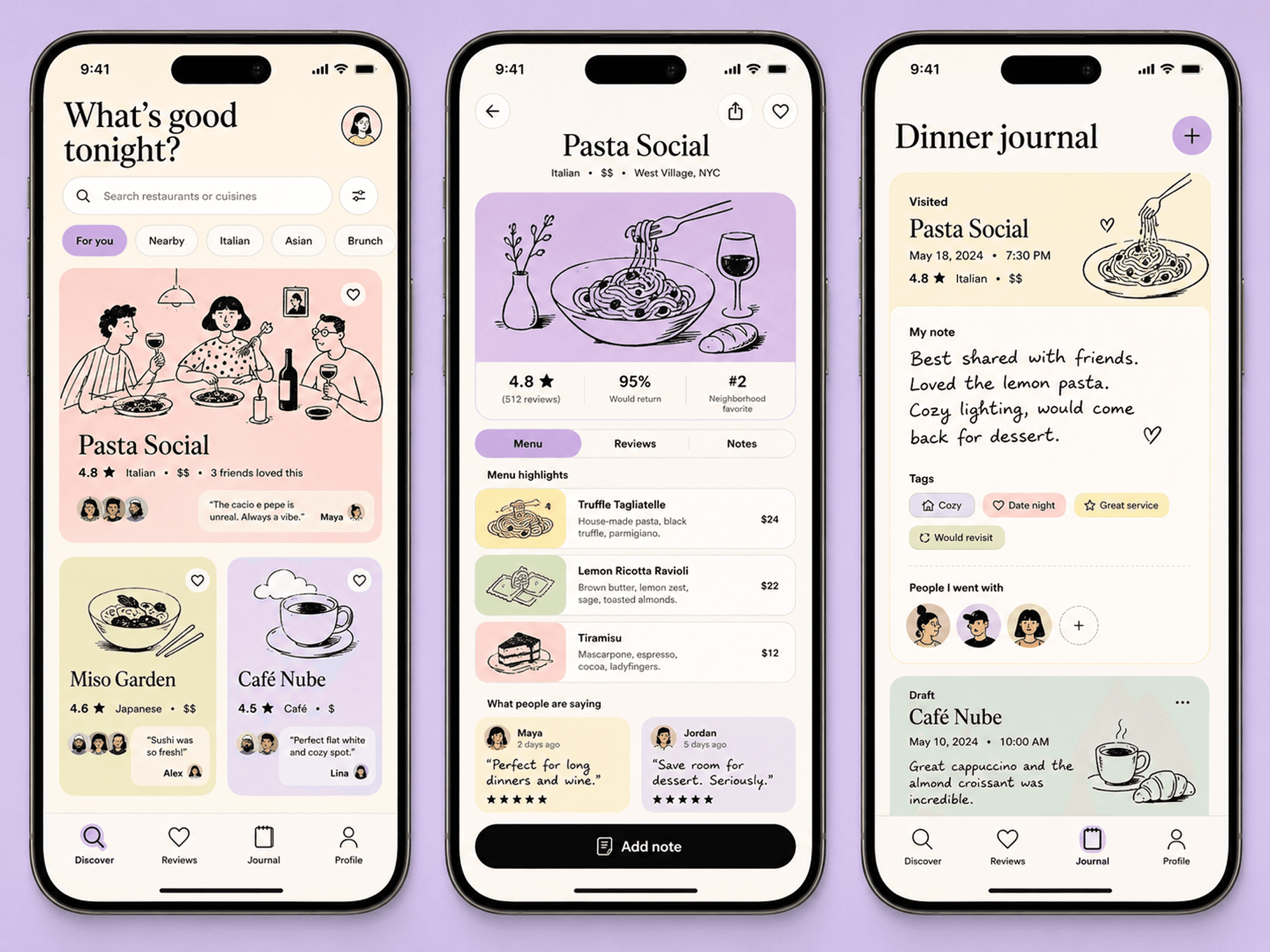
The same person wants to remember and discover.
Urban millennials and Gen Z who treat dining as an experience. They're already journaling informally — notes app, stories, camera roll. Forkd gives it a real home.
Two modes, one user: The same person wants to remember their own meals and discover what their friends love. Designing for both without making either feel like an afterthought was the core tension.
Visual Language
Monocle magazine meets a personal diary.
Editorial, not utilitarian
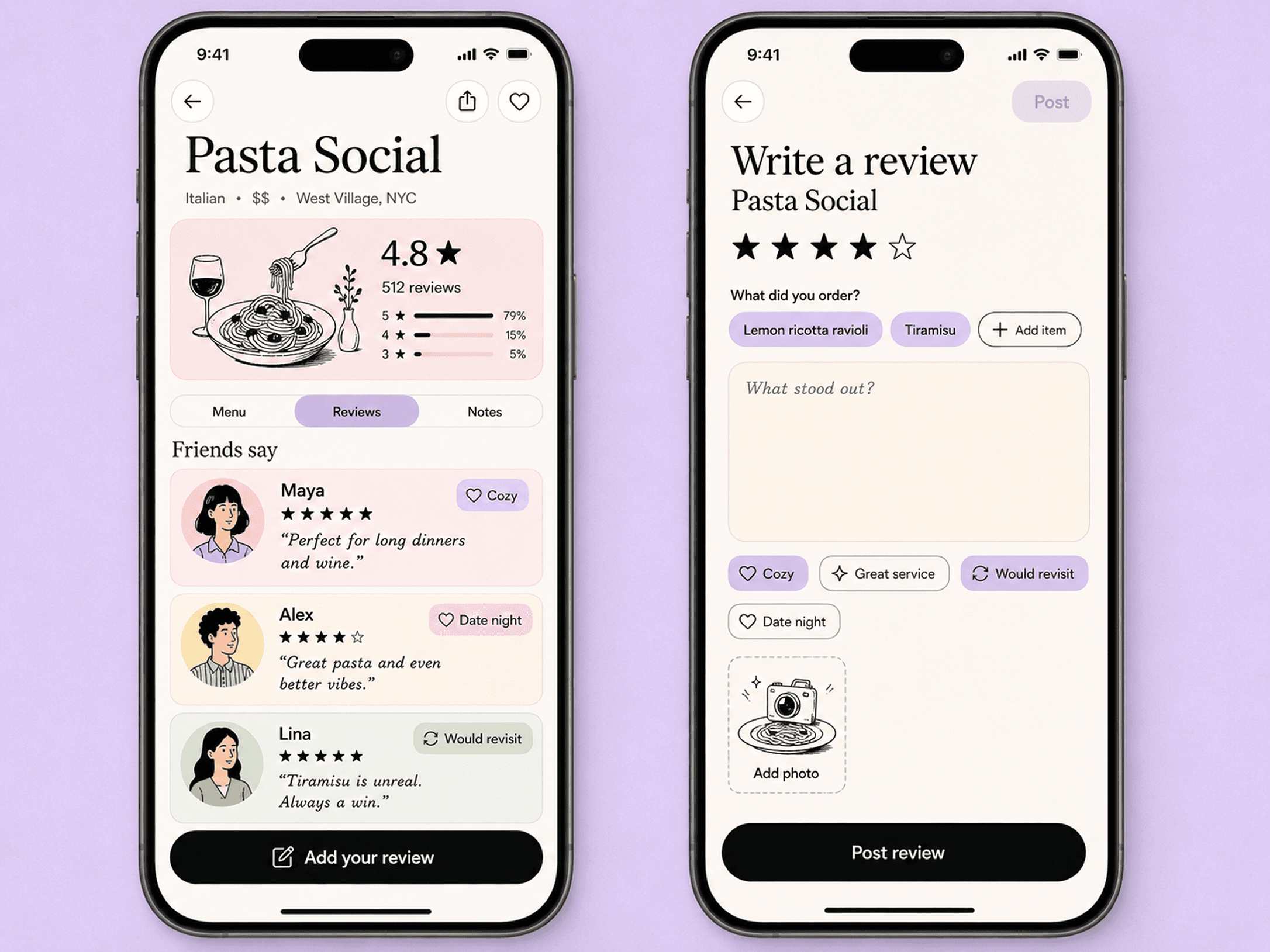
The brief I wrote for myself before opening Figma. Every visual decision had to feel warm, personal, and considered — not clean in the generic SaaS sense, but considered in the way a well-designed printed object feels.
Illustrations over photography
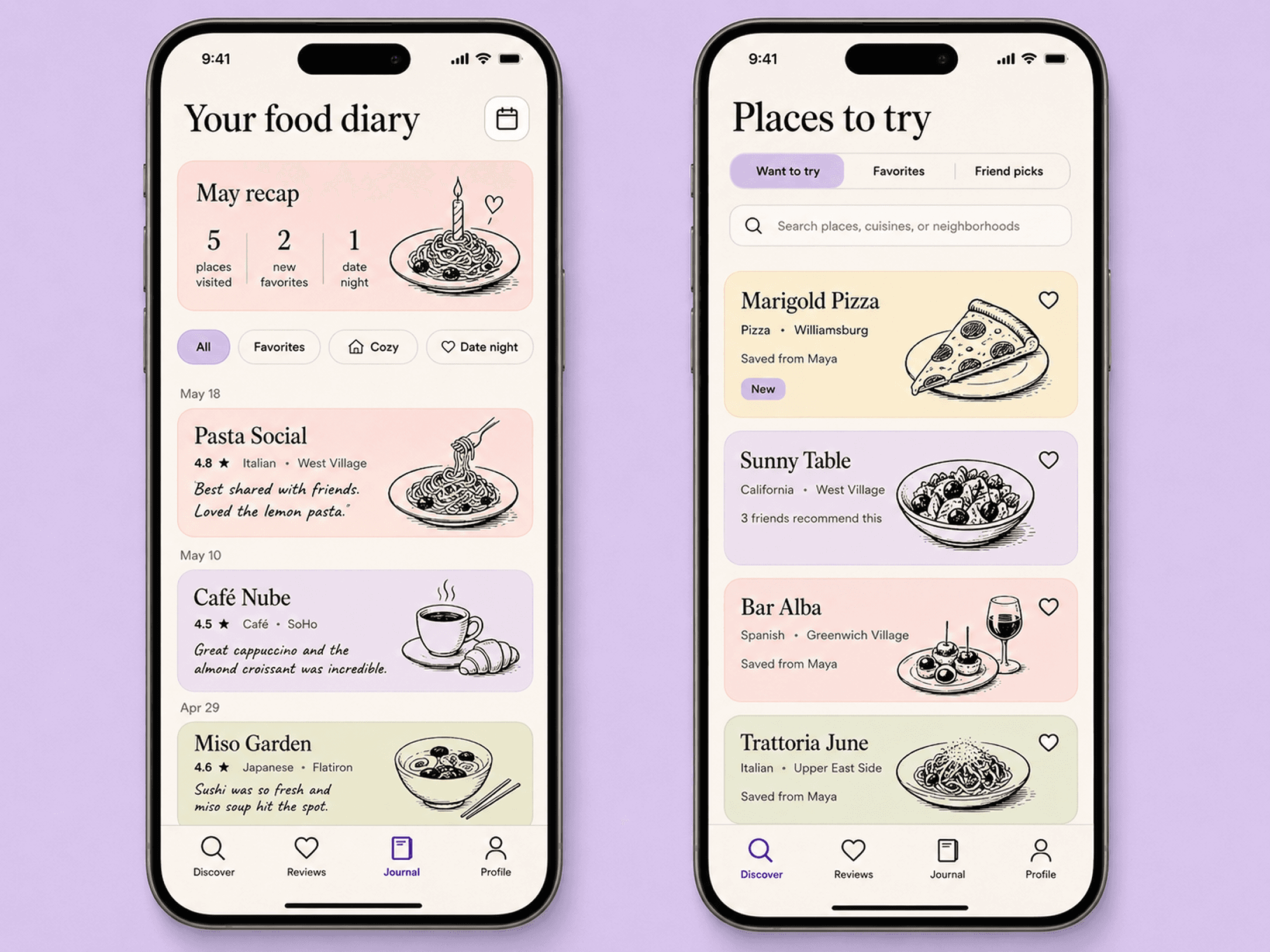
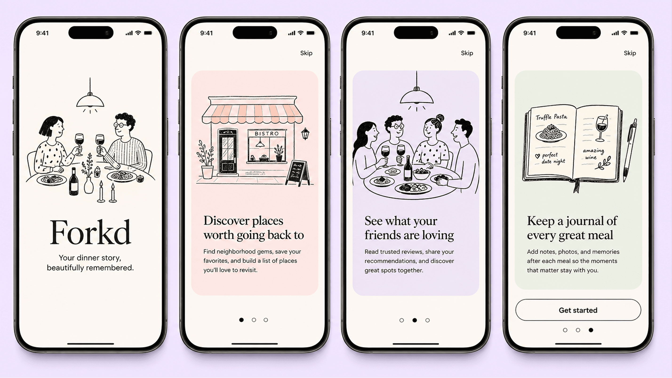
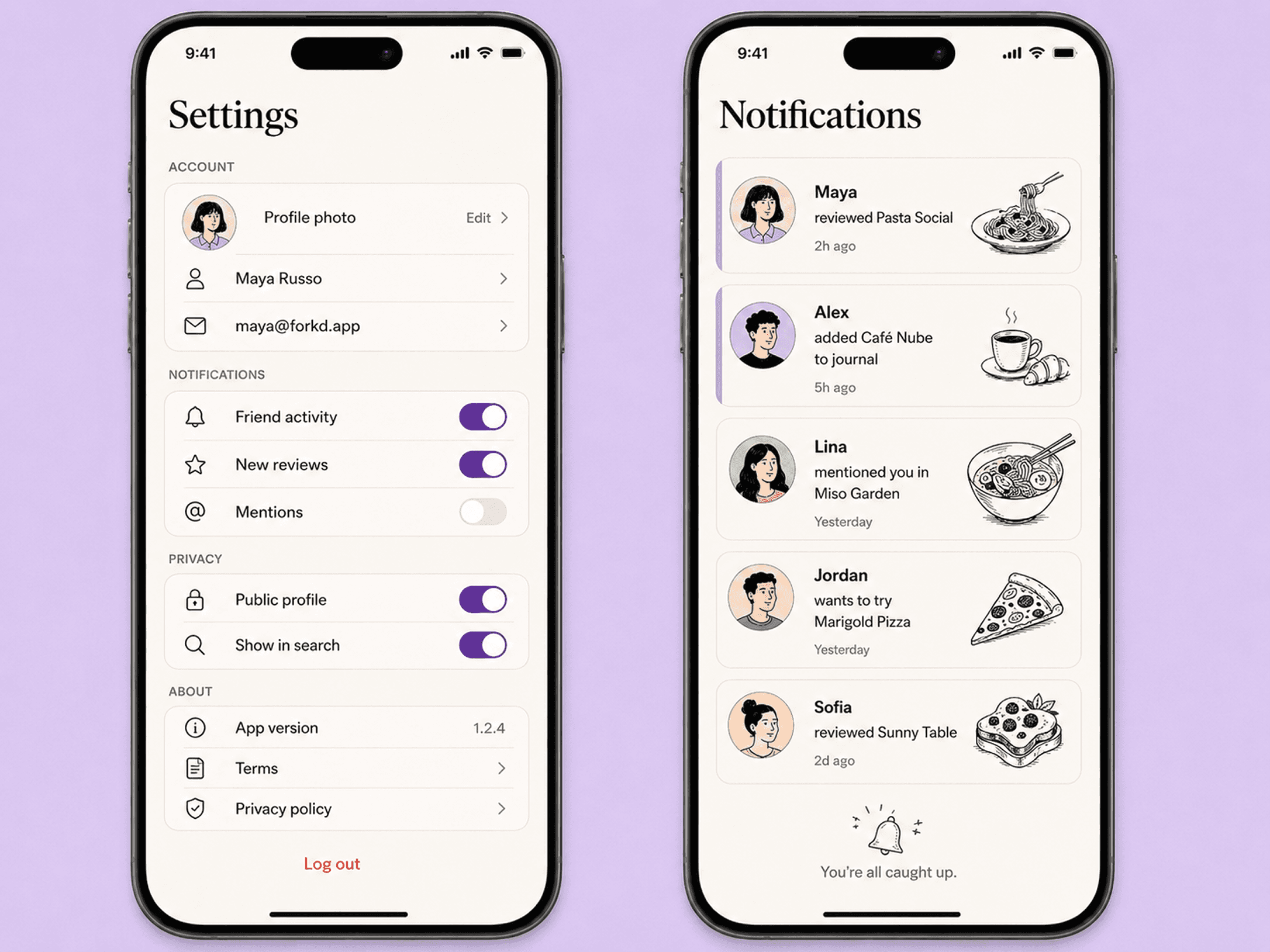
Hand-drawn black ink line art on pastel backgrounds. Photos would make this feel like Yelp. Illustrations make it feel like a journal — personal, consistent, and independent of user-generated content to look good on day one.
Typography doing two jobs
Playfair Display for headings, DM Sans for body. The serif makes a restaurant name feel worth remembering. The sans keeps everything readable at small sizes across 22 screens.
FROM FIGMA TO WORKING PROTOTYPE
Static screens don't demonstrate interaction quality.
The only way to show mobile feel is to build it. Real navigation, real transitions, real micro-interactions — not a clickable mockup but something that actually feels like a shipped app.
Tech Stack
React + Tailwind + shadcn/ui + Framer Motion. Design tokens matched to Tailwind conventions so the translation layer between design and code was zero.
iOS-style push transitions between screens. Heart button bounce on save. Staggered card entries on scroll. Each animation serves a purpose — communicating hierarchy, confirming action, establishing rhythm. Nothing decorative.
More Projects

Product Design
Forkd
Role :
Product Designer
Client :
Designed a 0→1 consumer mobile app for people who treat dining as an experience worth remembering — from product concept to interactive coded prototype.
Problem
Heading: People go to incredible restaurants and forget them. Body: The notes app is a graveyard of half-remembered names. The camera roll has no context. There's no product that treats a meal the way Letterboxd treats a film.
The Goal
Build a personal dinner journal that feels as good as the meals it captures — and surfaces what friends are eating without feeling like another social feed to perform on.
The design challenge
Consumer apps live or die by emotional resonance. Coming from fintech and Web3, the challenge wasn't complexity — it was warmth. Designing something that feels personal, not just functional.
Research and target user
The same person wants to remember and discover.
Urban millennials and Gen Z who treat dining as an experience. They're already journaling informally — notes app, stories, camera roll. Forkd gives it a real home.
Two modes, one user: The same person wants to remember their own meals and discover what their friends love. Designing for both without making either feel like an afterthought was the core tension.
Visual Language
Monocle magazine meets a personal diary.
Editorial, not utilitarian
The brief I wrote for myself before opening Figma. Every visual decision had to feel warm, personal, and considered — not clean in the generic SaaS sense, but considered in the way a well-designed printed object feels.
Illustrations over photography
Hand-drawn black ink line art on pastel backgrounds. Photos would make this feel like Yelp. Illustrations make it feel like a journal — personal, consistent, and independent of user-generated content to look good on day one.
Typography doing two jobs
Playfair Display for headings, DM Sans for body. The serif makes a restaurant name feel worth remembering. The sans keeps everything readable at small sizes across 22 screens.
FROM FIGMA TO WORKING PROTOTYPE
Static screens don't demonstrate interaction quality.
The only way to show mobile feel is to build it. Real navigation, real transitions, real micro-interactions — not a clickable mockup but something that actually feels like a shipped app.
Tech Stack
React + Tailwind + shadcn/ui + Framer Motion. Design tokens matched to Tailwind conventions so the translation layer between design and code was zero.
iOS-style push transitions between screens. Heart button bounce on save. Staggered card entries on scroll. Each animation serves a purpose — communicating hierarchy, confirming action, establishing rhythm. Nothing decorative.
More Projects
Product Design
Forkd
Role :
Product Designer
Client :
Designed a 0→1 consumer mobile app for people who treat dining as an experience worth remembering — from product concept to interactive coded prototype.
Problem
Heading: People go to incredible restaurants and forget them. Body: The notes app is a graveyard of half-remembered names. The camera roll has no context. There's no product that treats a meal the way Letterboxd treats a film.
The Goal
Build a personal dinner journal that feels as good as the meals it captures — and surfaces what friends are eating without feeling like another social feed to perform on.
The design challenge
Consumer apps live or die by emotional resonance. Coming from fintech and Web3, the challenge wasn't complexity — it was warmth. Designing something that feels personal, not just functional.
Research and target user
The same person wants to remember and discover.
Urban millennials and Gen Z who treat dining as an experience. They're already journaling informally — notes app, stories, camera roll. Forkd gives it a real home.
Two modes, one user: The same person wants to remember their own meals and discover what their friends love. Designing for both without making either feel like an afterthought was the core tension.
Visual Language
Monocle magazine meets a personal diary.
Editorial, not utilitarian
The brief I wrote for myself before opening Figma. Every visual decision had to feel warm, personal, and considered — not clean in the generic SaaS sense, but considered in the way a well-designed printed object feels.
Illustrations over photography
Hand-drawn black ink line art on pastel backgrounds. Photos would make this feel like Yelp. Illustrations make it feel like a journal — personal, consistent, and independent of user-generated content to look good on day one.
Typography doing two jobs
Playfair Display for headings, DM Sans for body. The serif makes a restaurant name feel worth remembering. The sans keeps everything readable at small sizes across 22 screens.
FROM FIGMA TO WORKING PROTOTYPE
Static screens don't demonstrate interaction quality.
The only way to show mobile feel is to build it. Real navigation, real transitions, real micro-interactions — not a clickable mockup but something that actually feels like a shipped app.
Tech Stack
React + Tailwind + shadcn/ui + Framer Motion. Design tokens matched to Tailwind conventions so the translation layer between design and code was zero.
iOS-style push transitions between screens. Heart button bounce on save. Staggered card entries on scroll. Each animation serves a purpose — communicating hierarchy, confirming action, establishing rhythm. Nothing decorative.